Useful & free data tools for learning about London’s economy, development & communities
For the first time ever, London is hosting London Data Week, a festival of events and exhibitions for people to learn and talk about how data can influence London for the better. At PRD we rely extensively on high-quality data to inform the work we do, so to contribute to the discussion, we’ll be publishing a series of journal entries to share our experiences with and ambitions for data in London.
London is a great city for open data, but a lot of it is squirreled away in repositories and spreadsheets. In this post, we’ve gathered a selection of some of our favourite data tools for learning about London’s communities and built environment, focusing on resources providing data to at least borough level. The data tools and dashboards below make data easily digestible using graphs and maps, which means you can focus on obtaining insight rather than sourcing and wrangling data.
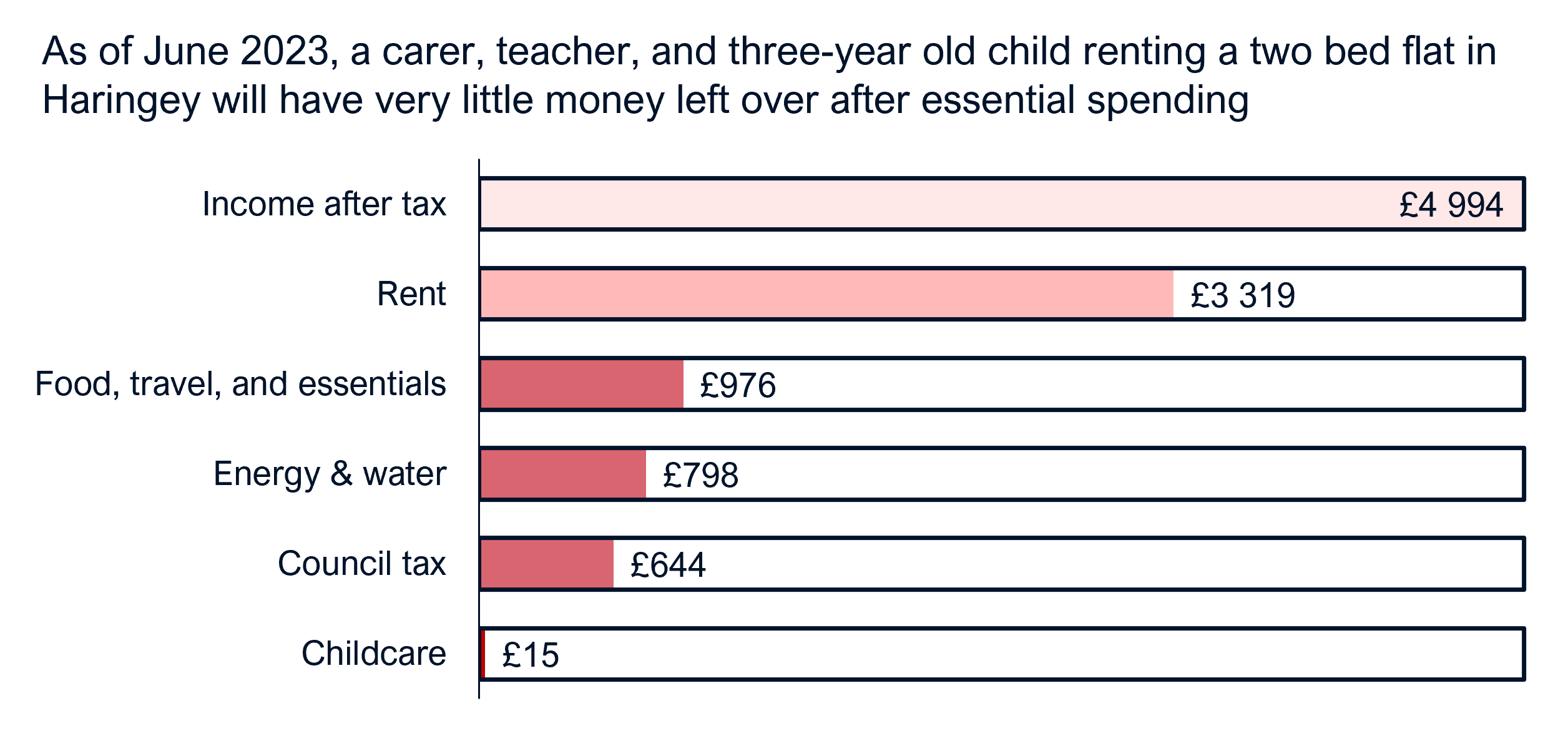
PRD Cost of Living Calculator
Last year, PRD colleagues Rose Jump and Will Temple developed an Excel-based Cost of Living Calculator to provide deeper insight into the lived experience of rising prices and to help local authorities, civil society, and private sector actors to model the cost of living crisis in their communities. The Calculator provides a starting point for understanding what household income actually buys once all essential spend has been considered. See this journal post for more information.
You can download the London Cost of Living Calculator here, which includes a built-in user guide and data assumptions. We update it a few times a year, so be sure to check back for the latest version.
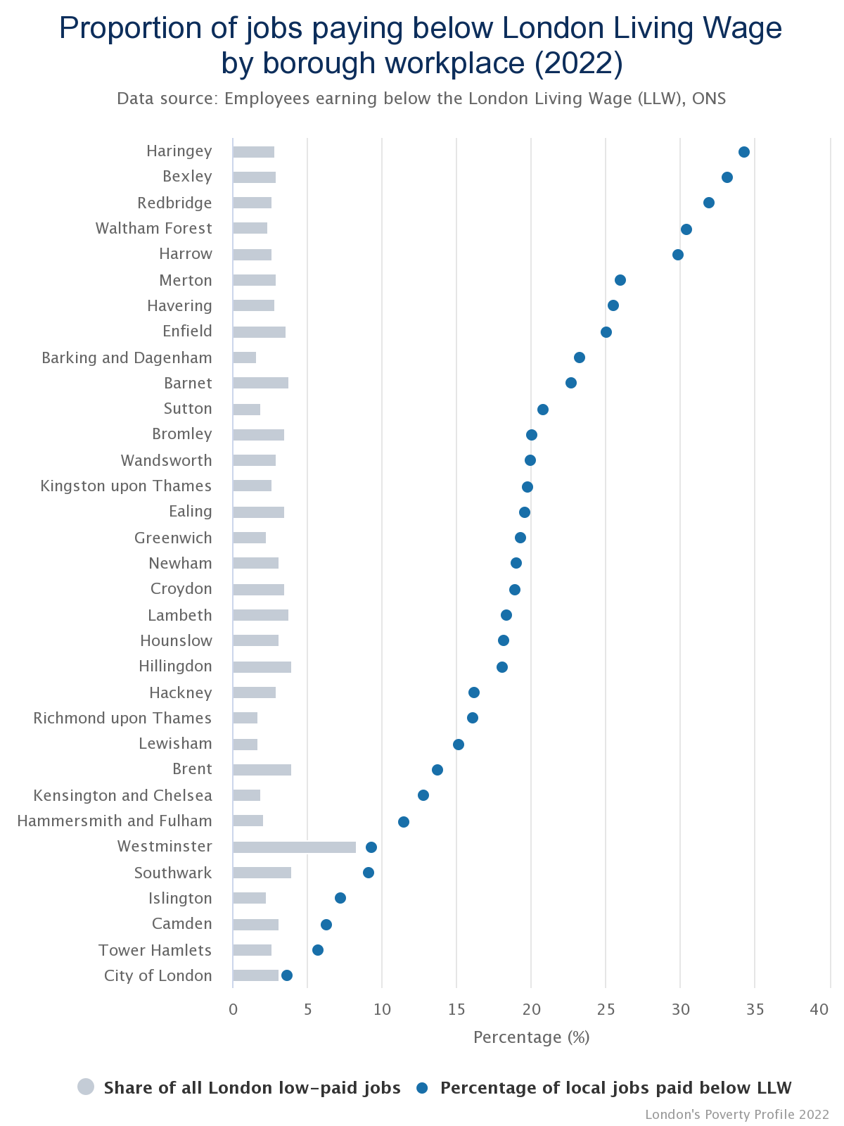
Trust for London Poverty Profile
Each year, charitable foundation Trust for London publishes borough-by-borough and cross-borough comparison graphs on a range of poverty-related metrics. London’s Poverty Profile is a hugely helpful resource for understanding poverty within and across boroughs—and how it’s changed over time. As a largely ‘live’ database, much of the Poverty Profile data is updated at least annually.
The data is extensive and brings together various sources, covering things like children in poverty, school attainment gaps, personal wellbeing, and low paid jobs per borough.
It’s also straightforward to use. The data can be downloaded as the graphs as shown or as a spreadsheet for further independent analysis or graphing.
Inside Airbnb
As of March 2023, London had around 75000 Airbnb listings, and just over half seemingly had no occupants at any point in the previous 12 months—a fact that may come as a gut-punch to anyone who has tried finding a room or home for long-term rent in the capital recently. As our housing crisis deepens, economic and housing studies need to get to grips with the landscape and impact of local short-term rental markets.
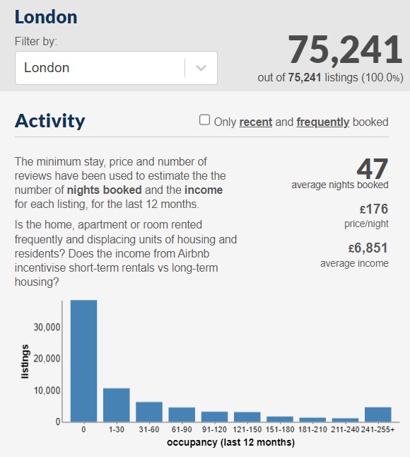
Enter Inside Airbnb, which collects individual Airbnb listings across London and aggregates the data to provide borough- and London-level stats. In addition to mapping specific listings by type (room vs entire unit), the site offers graphs and tallies on the number of listings per borough, average number of nights booked, minimum stays, and listings per host.
While the dashboard focuses on a snapshot from the latest quarter, keen analysts can easily download the previous 12 months of data from the site or make a special request for earlier archived data.
GLA Infrastructure Mapping Application & Planning London Datahub
The Greater London Authority’s Datastore is a treasure trove of data wonders, from data on London Fire Brigade animal rescues to Cycle Hire statistics to details of individual street trees. It can be overwhelming, but there are several data tools that take information from the Datastore and rework it into user-friendly formats.
One especially useful data tool is the Infrastructure Mapping Application (IMA), which plots information from planning applications, current and future infrastructure projects, and context data onto a single map. Planning data is collected regularly from London boroughs, so it is comprehensive and up to date.
Users can add layers to see different types of developments (e.g. residential, commercial, civic) or infrastructure and draw custom boundaries around an area. The custom boundaries can be used for basic in-dashboard calculations (e.g. number of residential units planned) or for exporting the associated data as a CSV or map layer for additional review or analysis outside of the IMA.
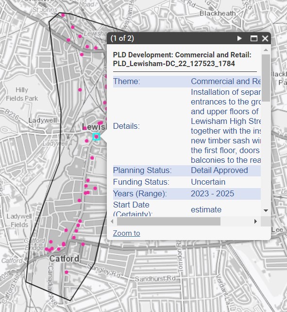
For an alternative, more detailed view of the residential data in the IMA, see the Planning London Datahub’s dashboards for development pipeline, planning approvals, scheme commencements, and scheme completions. The dashboards have a multitude of graphs, tables, and maps at the borough and London levels.
Consumer Data Research Centre
If you or your work are not London-based and you’re feeling left out of the data fun, the Consumer Data Research Centre (CDRC) is here for you. This academic project has published scores of maps covering not just London but the UK, with topics ranging from broadband service levels to town centre typologies to demographics.
Viewing the maps is as simple as selecting a topic and sub-topic from drop down menus and navigating around a map. Hovering over the map often provides area-specific information in a sidebar, and in many cases, the data behind the map can be downloaded as a spreadsheet or map layer for further analysis. Depending on the topic, data may be updated as frequently as yearly, though some topics use older or less frequent data. One of the great things about CDRC data is that it is provided at very small geographies (often LSOA), giving a hyper-local view of various metrics.
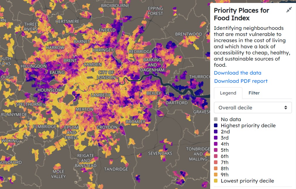
Among our favourite CDRC maps are:
- The Priority Places for Food Index, which ‘[identifies] neighbourhoods that are most vulnerable to increases in the cost of living and which have a lack of accessibility to cheap, healthy, and sustainable sources of food’
- The Residential Mobility Index, which ‘estimate[s] of the proportion of households that have changed between the end of the year selected and the end of 2020’—in other words, the level of household churn in an area
- Commercial building attributes, which provides building-level energy performance certificate data for a fairly large sample of non-domestic properties as of November 2022. With this data, it is possible to find clusters of poorly-rated buildings, see whether certain use types are better/worse rated, and understand the scale of buildings that will be affected by MEES regulations.
– By Amanda Robinson – get in touch to learn how to apply this and other data to your own projects or to share a useful data tool we should be aware of